Why Strautmann’s New Visual Identity Is a Business Decision**
Corporate design is often reduced to a simple question:
Do you like it or not?
For companies like Strautmann, that question misses the point.
Here, design is not about taste. It is about clarity, recognition, and long-term viability.
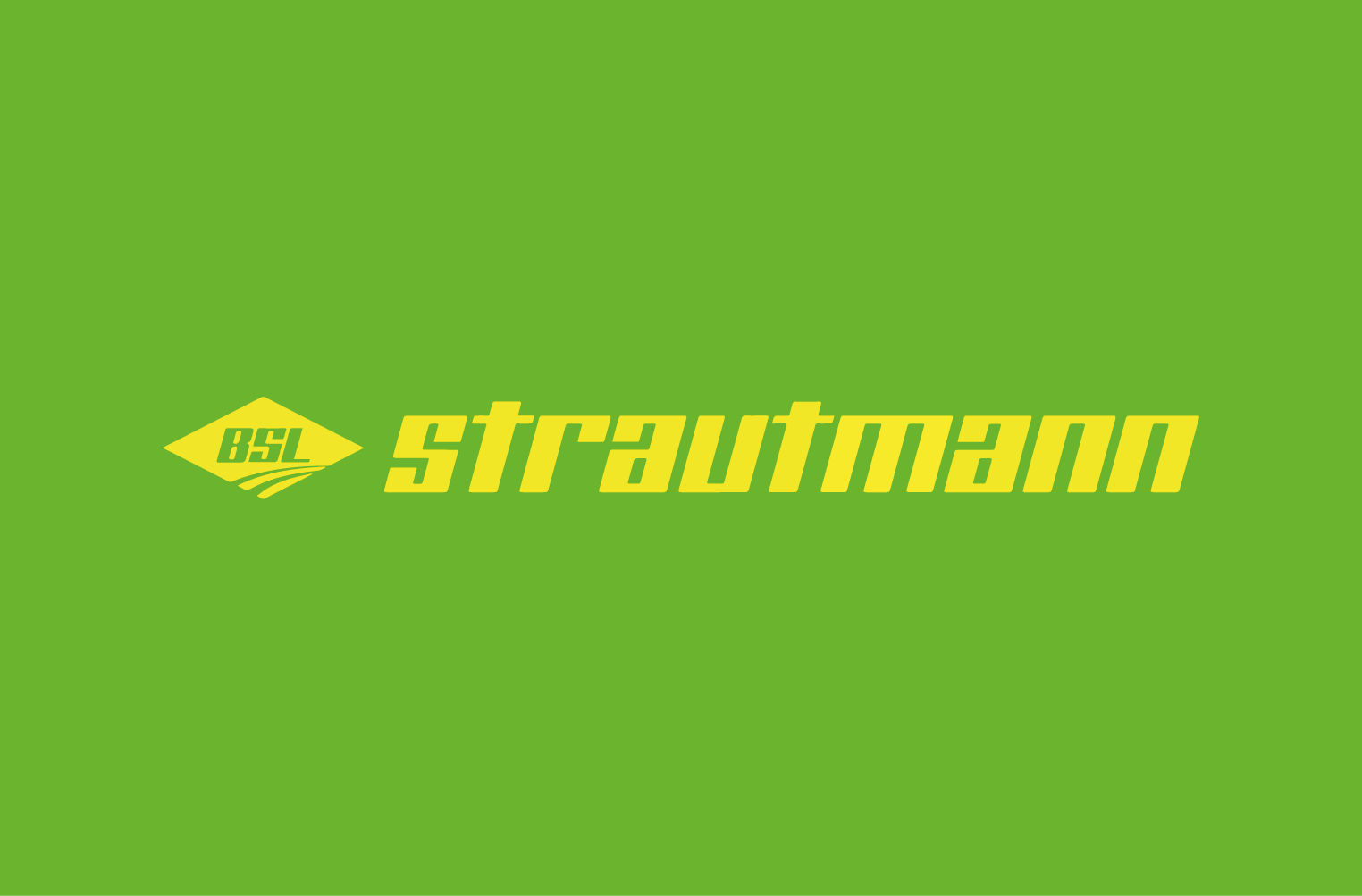
The Starting Point: A Mark That Needed Explanation
For many years, Strautmann’s appearance was defined by two elements:
the yellow strautmann wordmark and the BSL symbol inside a diamond shape (Bernhard Strautmann Lengerich).
Historically correct and internally well understood – but externally, increasingly in need of explanation.
In an international and competitive environment, heritage alone is not enough if it creates friction.
The key question therefore was not:
“What should we redesign?”
but rather:
“What needs to become clearer today?”
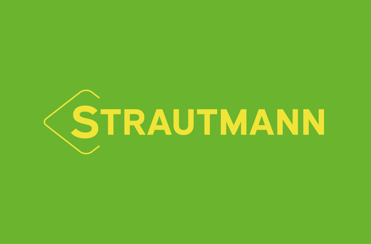
The Design Decision: Preserve – but Reframe
The solution was not a radical break, but a deliberate evolution.
The diamond shape remained – because it is part of Strautmann’s DNA.
But its role changed fundamentally.
No longer a container for an abbreviation, it became an iconic sign that carries the brand itself.
By combining:
-
a simplified, rounded diamond
-
an integrated “S”
-
and a clear horizontal orientation
a mark emerged that works instantly – on machines, at trade fairs, in digital contexts and at small scale.
A sign that does not need explanation.
Typography: From Motion to Confidence
The wordmark was also rethought with intention.
The former italic style conveyed movement, but little calm or authority.
The new uppercase STRAUTMANN wordmark, set in a precise, technically inspired typeface, shifts the brand’s posture:
-
less sportiness
-
more stability
-
more industrial confidence
The enlarged initial “S” visually connects the wordmark with the icon – reinforcing coherence and recognition.
What Really Matters: The System Behind the Logo
Good design does not end with a logo.
That is where it begins.
Colors, typography, application rules, product naming, trade fair appearances, machine labeling – everything follows a clear and consistent logic. The style guide is not a set of constraints, but a tool for coherence.
This creates a visual identity that:
-
remains robust over time
-
can grow with the company
-
and communicates consistently across all touchpoints
Impact Instead of Surface
Strautmann’s new visual identity is not a cosmetic exercise.
It is an expression of attitude:
-
clarity instead of explanation
-
reduction instead of arbitrariness
-
system instead of isolated measures
Or, put simply:
Design is not decoration.
Design is a decision.
And that is what makes corporate design truly effective.
About pr-ide
pr-ide develops design that creates impact – economically, socially, and visually.
We do not design for trends, but for real-world application.
Because good ideas do not belong in drawers – they belong in life.